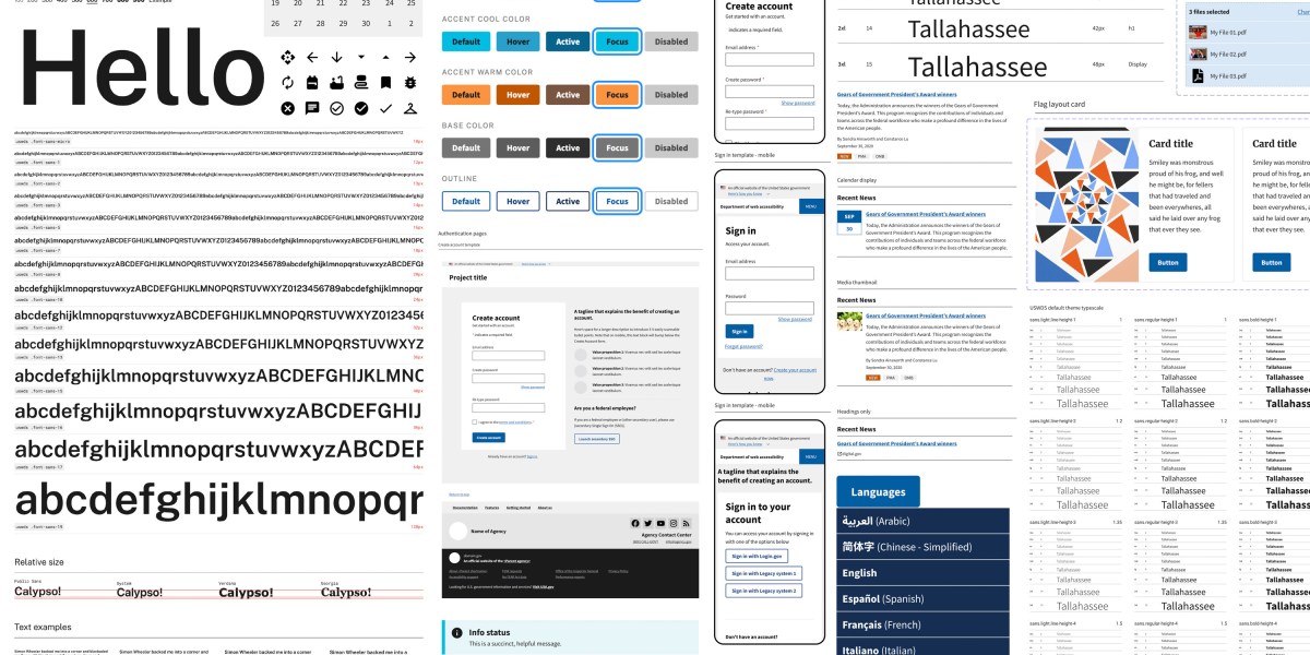
The US Digital Service (USDS) was set up “to deliver better government services to the American people through technology and design.” In 2015, the two teams collaborated to build the US Web Design System (USWDS), a style guide and collection of user interface components and design patterns intended to ensure accessibility and a consistent user experience across government websites. “Inconsistency is felt, even if not always precisely articulated in usability research findings,” Dan Williams, the USWDS program lead, said in an email.
Today, the system defines 47 user interface components such as buttons, alerts, search boxes, and forms, each with design examples, sample code, and guidelines such as “Be polite” and “Don’t overdo it.” Now in its third iteration, it is used in 160 government websites. “As of September 2023, 94 agencies use USWDS code, and it powers about 1.1 billion page views on federal websites,” says Williams.
To ensure clear and consistent typography, the free and open-source typeface Public Sans was created for the US government in 2019. “It started as a design experiment,” says Williams, who designed the typeface. “We were interested in trying to establish an open-source solution space for a typeface, just like we had for the other design elements in the design system.”
The teams behind Public Sans and the USWDS embrace transparency and collaboration with government agencies and the public.
And to ensure that the hard-learned lessons aren’t forgotten, the projects embrace continuous improvement. One of the design principles behind Public Sans offers key guidance in this area: “Strive to be better, not necessarily perfect.”
Jon Keegan writes Beautiful Public Data, a newsletter that curates visually interesting data sets collected by local, state, and federal government agencies
(beautifulpublicdata.com).