The Bets Dressed third edition of uniform power rankings was released this week, and the Tennessee Titans rank at the bottom of the list. Before diving into the actual rankings, the author describes his process and makes clear that his evaluations are subjective. Every attempt is made to remain unbiased, but ultimately, this is one person’s opinion.
The Titans most recently changed their uniform design in 2018. That year, they updated the blues only slightly and changed the shoulder stripe from blue to silver. Last year, they revealed new Oiler throwbacks, which may be what actually put them at 31, just above the Washington Commanders. Let’s be real, those Oiler uniforms were awful.
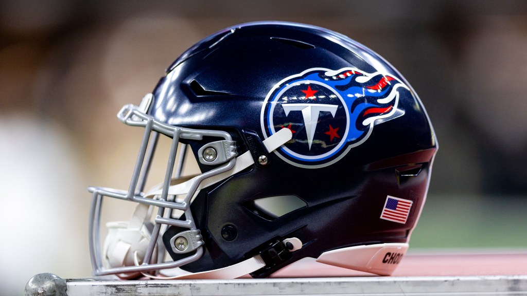
Setting aside an underrated color palette and the Oilers throwbacks, there’s not much going for the Titans aesthetically. Navy helmet curbs any semblance of contrast – both within the helmet and the rest of the wardrobe. Underarm panels* are the Panelist Era’s last stand. The two-tone gray “sword” yoke is both cheesy and a downgrade from the dated yoke on the original Titans uniforms.** And the spindly font is too slender and does nothing to alleviate the cheesiness.
Something to Fix: If a return to the Tennessee Oilers remains out of the question, let’s shoot closer to the originals for inspiration.
Dream Super Bowl: Titans (Navy-White-Light Blue) at 49ers (Gold-Red-Gold).
*Uncanny resemblance to do-not-disturb door hangers.
**Underrated now thanks to the current train wreck. Classic case of careful what you wish for.
As indicated above, this is only one person’s opinion. The current Titans uniforms and helmets are well-accepted by the fan base, and honestly, this writer has vastly different ideas of what this ranking should look like.
At the end of the day, though, it really doesn’t matter what the players are wearing. What matters is whether they win or lose. And the Titans are poised to have a solid 2024.

