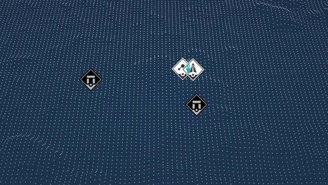
You’ve probably heard this before, but Starfield, Bethesda’s latest open-world RPG, is very, very big. The new game, out now in “early access” on Xbox and PC, spans multiple solar systems and hundreds of planets. And when exploring that vast digital galaxy, the in-game maps are fine. But once you land on a planet or land in a city, the in-game map system goes from fine to awful.
Bethesda’s Starfield launched early for deep-pocketed players on Thursday after years of hype and following some sneaky leaks. The massive space RPG lets players explore a digital galaxy filled with hundreds of planets and quests. And early on, I only used the maps in-game to fast-travel to new planets. But once I landed in the first big city, New Atlantis, I opened up the surface map and set my eyes upon the horrible blue mess that is Starfield’s local “map.”
Calling the blue-and-white grid of floating icons and featureless void a “map” feels generous. Maps, even the worst of them, are useful to some degree. The local planet map in Starfield isn’t useful at all. Not in the slightest. Look at this and try to figure out…anything!

Fans jumping into the game are complaining on Reddit about the map and also comparing it unfavorably to past Bethesda town maps, like the ones in The Elder Scrolls: Skyrim. And it’s true, comparing them directly, it’s frustrating to see Bethesda take such a backward step on such an important feature. Being able to pop open a map and look around the area for a shop or quest is very handy in a massive RPG. Yet, this horrible blue nightmare gives you no real context—like hills, roads, etc—for where these places actually are, or how to get to them.
Instead of the local map, use the scanner
I’ve given up trying to use this map and have mainly relied on the scanner tool in Starfield. This feature lets you pop open an augmented reality-like HUD that lets you see where shops, quests, and other important places are in the world by just looking around. It also draws a path on the ground for you to follow to reach your objective and lets you fast-travel to locations you’ve visited simply by aiming at them and clicking a button. It’s not a replacement for a local map, but considering the awful blue void Starfield considers a map, it’s the best option at the moment.
It’s odd because I find the game’s galaxy and space maps pretty dang good, for the most part. Sure, I wish space travel was a bit more “traveling” and less just menu hopping, but when I need to look at planets and solar systems in Starfield, the maps are good. They feature textured planets and recognizable recreations of the areas you want to visit. You know, like a map!
But land on one of those planets or cities and you’ll be stuck using that horrendous floating grid of icons.
I assume that in the next few days and weeks, Starfield modders will quickly add local town and planet maps, as this is quickly becoming one of the biggest complaints I’ve seen from fans. Even people who are enjoying the game immensely, like myself, are struggling with the awful excuse of a local map that currently exists in the game.
.

