From the Winter 2023 issue of Living Bird magazine. Subscribe now.
Don’t it always seem to go
that you don’t know what you’ve got till it’s gone?
They paved paradise, and put up a parking lot
—Big Yellow Taxi by Joni Mitchell
Joni Mitchell wrote those lyrics in 1970, in response to the destruction of natural forests in Hawaii. Since then, North America has lost a third of its overall bird population. Rare and common species alike. A vast, silent ecological catastrophe numbering billions of birds across an entire continent. And it continues today.

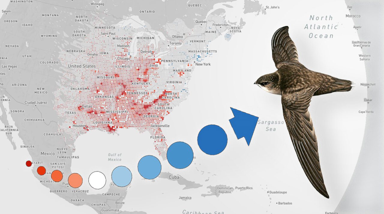
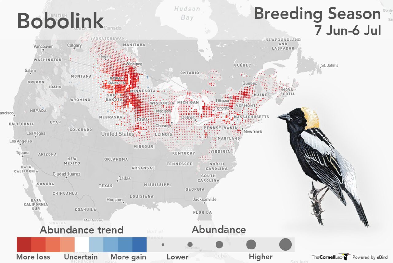
This devastating message is viscerally demonstrated in two recent projects in which the Cornell Lab of Ornithology played a lead role. In October, the 2022 U.S. State of the Birds Report quantified the decline in bird populations across almost every habitat, and identified 70 Tipping Point species—currently unprotected birds that have lost half of their population since 1970 and are predicted to lose another half in the next 50 years. They include what many of us might regard as everyday birds, like Allen’s Hummingbird, Chimney Swift, Golden-winged Warbler, and Bobolink. The report makes clear that if we do not act now, we will not hand on these species to our grandchildren.

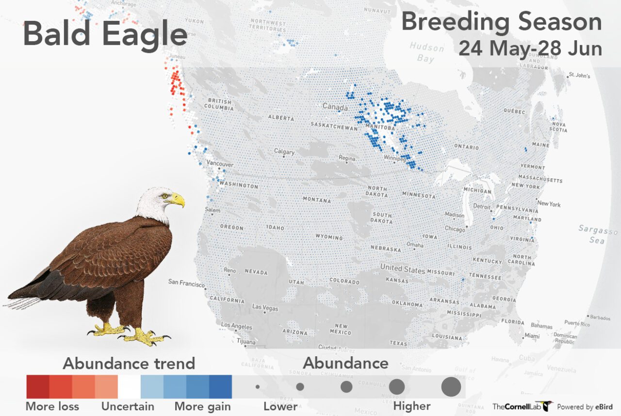
In November, the Cornell Lab released the next generation of eBird Trends maps, which contained more sobering news. The data visualizations use machine-learning methods to analyze hundreds of millions of observations by eBird citizen scientists and map out population trends for over 500 species. Blue dots show population increases, red dots signal declines. Many maps are a sea of red dots. I urge you: Look at these maps. Pick your favorite birds and click through them. Tell me what you see and what you feel.
My hope has been given substance by recent analyses showing how it is possible to bend the curve for biodiversity—to reverse historical declines in populations, and do it before it’s too late. These analyses show bending the curve requires three things: conservation of vulnerable habitats and species, large-scale restoration of ecosystems for biodiversity and carbon capture, and more sustainable production and use of resources by humans. I believe the eBird Trends data are a turning point in this respect because they allow us to target conservation far more precisely than before, to monitor the success of restoration projects, and to find the smartest ways to get a balance between nature and human activities.

