I grew up in a modest home. The open floor plan encouraged us to spend our days in the kitchen, both during and outside of meal times. My family would gather around the table—doing homework, chatting idly, and simply sitting in each other’s company. The space—despite its size—boasted a certain organic flow and openness, one that flooded the room with an aura of calm. There was a lot that contributed to this, but for me, the built-in shelves that wrapped their way around the walls put even my childhood self at ease.
Built-in shelves encourage creativity, inviting us to display both sentimental objects and things we want within reach. They lend themselves well to our increasingly visual world—the subject of design content across Instagram and TikTok. But no matter how relevant they seem now, built-in shelves also hold a timelessness surpassing the whims of micro-trends.
10 Built-In Shelves That Prove the Timelessness of the Trend
The past decade of design has seen the first whispers of a move away from floating shelves and free-standing armoires in the direction of a new kind of built-in—one that’s modern, minimal, and not necessarily symmetrical. (Though an air of balance remains a priority.) Utilizing natural materials and organic edges, today’s designers are creating storage solutions that go beyond chic, instead putting weight on visual storytelling that’s elegantly executed and thoughtfully curated.
Need to see it to believe it? Take a look at these 10 spaces.
Contemporary Coziness
Camille has perfected her living room built-in shelves over the years, and the most recent iteration is pure, uncomplicated comfort. I love how she keeps the styling intentionally pared down. The impact is decidedly minimalist but with a warmth and visual interest that keeps the eyes moving about.
Read more: My Best Bookshelf Styling Tips Ever—Just in Time for Fall
Color Pop
The Yves Klein blue gives this built-in bookshelf the contrast needed to make it pop. By keeping the shelves’ elements relatively minimalist and the colors surrounding them neutral, the effect is impactful without going overboard.
Warm Minimalist
Sometimes, second-hand purchases are best, leaning into the pieces’ time-worn narratives. I love this curation of vintage finds and the reliance on textural variation to create interest in an otherwise neutral color palette.
Sumptuous Simplicity
This neutral approach to built-in shelves strikes the perfect balance between minimalism and warmth, creating a space that feels both curated and lived-in. By opting for a muted color palette of creams, soft taupes, and natural wood accents, the shelves act as an understated backdrop that allows carefully chosen objects to shine.
Classic Farmhouse
Here, the styling emphasizes organic textures—think ceramic vases, woven baskets, and gilded frames—that add depth without overwhelming the eye. It’s a thoughtful, intentional display where every piece tells a story, yet nothing competes for attention. This approach to neutral design highlights how subtlety can create a sense of calm and sophistication in any room.
Cohesive Minimalist
This chic, monochromatic approach to styling built-in shelves showcases the power of layering tones and textures within a single color palette. With soft whites, muted grays, and natural wood accents as the foundation, the space feels cohesive yet dynamic. The interplay of hard and soft elements—crisp lines juxtaposed with touches of greenery—creates a room that feels both polished and inviting.
Library Vibes
This inviting, English-style home strikes a perfect balance between functionality and warmth, curating found objects for a cozy, lived-in feel. The colorful array of books (that have clearly been read and aren’t just meant for display) add warmth and texture within the open cabinetry. The stoneware vase, ornate chandelier, and floral rug lend a touch of time-worn beauty, making the room feel more personal and approachable. It’s a space where simplicity meets sophistication, ideal for both casual gatherings and quieter moments.
Effortless Elegance
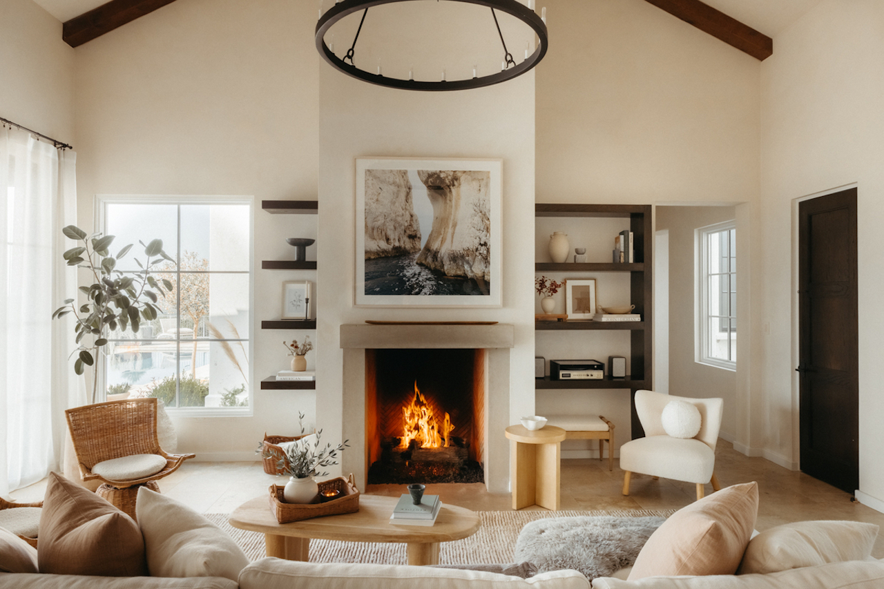
This serene living room embodies design-driven ease, with a harmonious mix of natural materials and modern touches. The soft, neutral palette creates a calming backdrop, while the textured rug and plush seating invite relaxation. Minimalist furniture with clean lines enhances the sense of spaciousness, and the carefully curated decor—ranging from earthy ceramics to organic greenery—adds subtle warmth and personality. It’s a space that feels both refined and inviting, proving that simplicity and comfort can beautifully coexist.
Rustic Charm Meets Modern Sophistication
This space is all about contrast and depth. The color palette remains pared down while thoughtful touches of textural ground the room in comfort. There’s a natural warmth communicated through the bouclé ottoman and velvet couch that’s met with a contemporary edge. Soft lighting casts a cozy glow, enhancing the intimate atmosphere. Subtle details—like the simple ceramic tableware and understated greenery—add an organic touch.
Light and Bright
White is a solid choice to ground your built-ins, allowing you to weave color and texture through styling pieces and personal touches. Here, the effect is perfectly balanced, allowing found objects and photographs to add depth without overwhelming the senses. With its layered textures and thoughtful design, these built-in shelves are a perfect example of how minimalism can still feel warm and welcoming.

